
Keeping Claude inside the design system
Tokens, base components, complex components, patterns, layouts
Claude is good at making things look right. It's much worse at making them look the same twice. I wanted to see if I could get it to stay inside a design system instead of quietly inventing a new one every time I asked for a page. Everything on this page is live output from the test system I built, so you can click around in it.
Why it drifts
Ask for a component library in one prompt and it looks great for about an hour. Then you notice two different blues, three button paddings, and a dark mode that only half works. The model isn't careless. It just doesn't remember what it decided yesterday, so it decides again, slightly differently.
I stopped trying to fix that with better prompts. I wrote a skill that changes how Claude works instead: a fixed order, decisions that get written down, and a set of checks it can't skip.
The setup
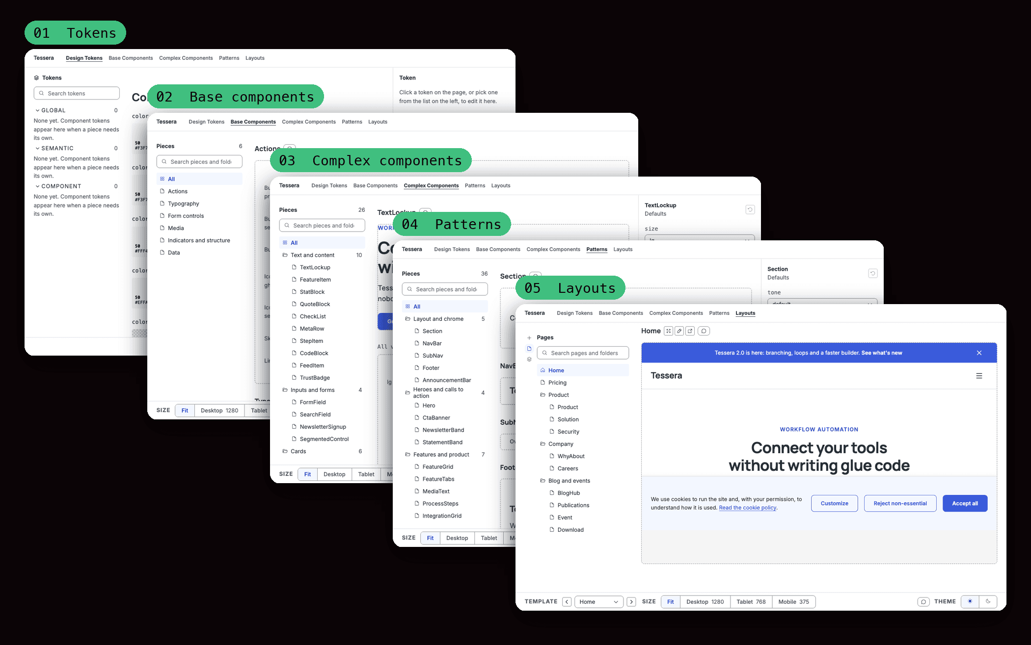
The system is built in five layers, and each layer can only use what's below it.
- Tokens. Color, type, spacing, radius, shadow.
- Base components. Buttons, inputs, badges, icons.
- Complex components. Form fields, cards, accordions, alerts.
- Patterns. Hero, nav, feature grid, pricing table.
- Layouts. Whole pages.
Claude finishes a layer, stops, and waits for me. I either approve it or leave a comment on one specific piece in the preview, and that comment becomes its to-do list. Every approved decision gets written to a file and locked, and changing a locked one means asking me first. By the end there were 102 of them.
Two smaller things matter more than they sound. Every piece has a short summary card (what it does, its props, what uses it), so Claude reads a few lines instead of crawling folders to find its way around. And the approve command refuses to advance if the lint or contrast checks fail. Claude can't talk its way past that.
Here's the whole thing as a workbench. Each layer has its own tab, and I use the same view to review everything Claude builds.
1. Tokens
This is the layer everything else leans on. Everything starts from a single brand color. A script generates the full ramp from it, and another checks contrast. Claude never picks a hex by eye. If a color fails the check, it changes which step of the ramp it uses. It doesn't get to nudge a value until it passes.
On top of the raw ramps sit semantic tokens, named for the job they do: background, surface, text, border, primary action, focus ring, error. Components only ever reference those. I also had it set up the dark mode names on day one, even though the dark values came later, because renaming a token after forty components use it is miserable.
The part I like most is surfaces. A section can sit on a light, dark or colored background, and every semantic token gets remapped for each one. A component doesn't know or care which it's on. It just asks for "text" and gets the right color.
The rule that holds it together is a linter. Nothing above this layer may contain a raw color, a pixel value, a font name, a duration or a z-index. If a component needs a value that has no token, Claude has to add the token and reopen this phase. It can't hard-code around the gap.
2. Base components
These are the small things: button, link, heading, text input, checkbox, badge, icon. There are 21 of them, and they all get built before anything else does. That's deliberate. If Claude discovers it needs another base component while building a pricing table, everything above it might need rework. So this is the one layer that gets finished in full up front.
I made it explicit what isn't a base component. Tooltips, modals, tabs and accordions all need layering, focus management or state, so they live a level up.
A few rules apply to every one of them. Use the native element first (button, a, input, select) because it's more accessible and it translates to Webflow without drama. One focus style, everywhere. Controls are at least 44px. Form fields bump to 16px on small screens so iOS doesn't zoom in on focus. And Heading keeps its level (the document outline) separate from its size (how it looks), so a visual choice never breaks the page structure.
Inputs also don't contain their own label or error message. That belongs to FormField, a layer up, so the line is drawn early.
3. Complex components
A complex component is a few base components working together: a form field, a card, a pricing block, an accordion item, an alert. The rule is that they only import base components and never restyle them. If one needs something that doesn't exist, Claude stops and reopens the base layer instead of styling a raw tag in place.
I didn't pick this list myself either. A script reads a catalog of what every page in scope is made of and works out which complex components are needed, and the full set gets built before any patterns. Same reasoning as before: a gap discovered later is expensive.
This is where a lot of the small, boring, correct decisions live. FormField wires up the label, the help text and the aria attributes automatically, and an error replaces the help text instead of stacking under it. AccordionItem is a native details element, so it works with no JavaScript. Cards use a border and no shadow, a choice that was made once and locked so no card ever argues with another.
4. Patterns
Patterns are the page sections: hero, nav, footer, feature grid, pricing table, call to action. There are 38, and this is the first layer built in waves rather than all at once, starting with whatever the home page needs. It's also where the system can quietly turn into a pile of one-offs, so a few rules matter here.
One component, Section, owns the container width, the gutter and the vertical padding. No other pattern gets to set its own. That single decision is why every section on every page lines up.
A pattern is a family, not a single layout. A hero has layouts, sizes and slots. A feature grid takes anywhere from 3 to 8 items and has to look right at every count, with no orphaned card in the last row. A script checks that at the end of the phase, and a missing variant fails it.
Some of the decisions come from actually looking at it. The nav switches to inline links at 1024px, not 768px, because five links and two buttons don't fit at tablet width. Modal is built on the native dialog element so focus trapping and Escape work for free. And before moving on, Claude has to say whether each piece can be built natively in Webflow, needs a small custom embed, or can't be built at all. I wanted to know that now, not at sync time.
5. Layouts
A layout is a page made only of approved patterns. If a page needs something that doesn't exist, Claude has to stop, name the missing piece, add it to the right layer and send me back there. It is not allowed to write a one-off inside the page. That single rule is what keeps the system from fragmenting.
Layouts add no CSS of their own. Spacing comes from Section, and the shared header, footer and cookie banner live in one place so every page gets identical chrome. Each layout also has a spec: a table of which patterns it uses, in what order, on which background, and why each one is there. One of the rules it follows is that two colored sections never touch.
At the end, Claude audits the rendered page at three widths: one h1, no skipped heading levels, skip link first in the tab order, no horizontal overflow, contrast checked on every surface. This is Home. Flip it between light and dark, then try mobile.
Once the patterns were approved, new pages stopped being a design problem. Pricing uses the same buttons, badges and card shell as Home. It just arranges them into a plan table, a comparison and an FAQ.
I also tried a security page, because it's about the worst case: dense, full of controls and badges and small print, and no room for one-off fixes. It came together from existing patterns.
What worked and what didn't
- Consistency worked. Eleven layouts, 96 pieces, and still one spacing scale.
- Accessibility came along for free because skip links, focus states and contrast checks were part of "done" from the start. Controls are 44px. The plain link lists in nav and footers are 32px, which meets WCAG 2.2 AA, and whether to raise them is still an open question.
- The same token files synced out to Webflow variables, with Figma as the next target.
- It didn't help with taste. Claude builds what you specify. I'd already noted that the radius should probably be sharper for a "precise" brand, and it was still on me to decide.
- It's slower up front. All the stopping and approving feels like overkill when you could just prompt for a page.
Next
I want to run the same skill on a real brand, probably this site. The real question is whether a system Claude helped build still makes sense to someone else a year from now.
Let's make itBeautiful
